AltDash - Dashboards that just stare back at you are mostly wallpaper
17/05/2026
I think most personal dashboards are just prettier browser tabs. If I can't turn the thing I'm looking at into a capture, project, or brief seed, it's probably just digital wallpaper.
I keep almost building the same trap.
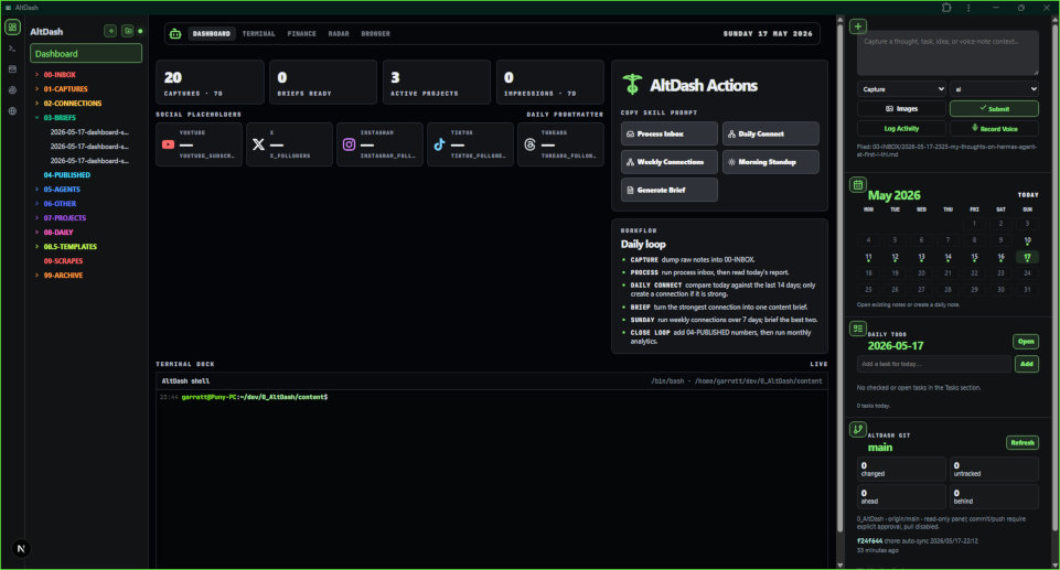
A dashboard full of useful looking widgets. Some feeds. Some stats. A Product Hunt panel. GitHub repos. YouTube videos. Finance graphs. Maybe a weather widget because apparently every dashboard needs to tell me the outside exists, even though I live in Queensland and the answer is usually “hot” or “stupidly hot”.
And then what?
That's the part that keeps annoying me with AltDash and Radar. I can build something that looks useful as hell and still doesn't change anything. It can show me ten products, twenty repos, three graphs, my daily note, my todos, some AI news, maybe a bunch of links I should totally read later. Then I close it and nothing happened.
That's not a system. That's just a prettier version of having too many tabs open.
I don't need more things to stare at. I already have browsers for that. Browser tabs are basically a dashboard already, just a shit one with favicons and shame.
The useful version has to shorten the distance between seeing something and doing something with it.
That's probably the whole rule.
see signal -> capture it -> process it -> connect it -> brief it -> write/build from it
If a widget doesn't help that chain, maybe it's still nice. Maybe it looks cool. Maybe it makes the page feel more alive. But it's probably decoration. Not evil. Not useless in the grand philosophical sense. Just not the thing I actually need.
This came out of a few separate notes that didn't look connected at first. I was looking at Glance because it has that dense dashboard feel I like. Compact widgets, small bits of information, enough structure that it feels like a tool rather than some over-designed SaaS landing page pretending to be an app.
Then there was Product Hunt, which is obviously useful as a signal source. Every day there are people launching things, some of it garbage, some of it clever, some of it something I could write about, clone, compare, or steal ideas from. Not steal in the “copy their homework” way, more in the “oh that's an angle” way. Which is basically half of product development if we're being honest.
Then Awesome Self-Hosted is sitting there being this giant pile of potential content. Every decent project in that list could be a review, a setup guide, a “why are people paying for this when the open-source version exists?” post, or just something useful to install and test.
So I have these feeds. Sources. Inputs. Whatever.
But a feed by itself doesn't do shit.
I can open Product Hunt right now, see something interesting, think “yeah that's worth looking at”, and then lose it immediately. Or bookmark it into the same graveyard where all bookmarks go to die. Or leave the tab open for three weeks because Future Garratt is apparently very organised and definitely coming back to it. He is not. He's off building some other half-finished thing and pretending this one counts as research.
The missing bit is the capture pipe.
Every interesting row in Radar should have an obvious action. Save to Inbox. Turn into project idea. Turn into brief seed. Maybe attach a quick note saying why I cared before the thought evaporates. Then it should land in the same AltDash workflow as everything else.
Not in a second database. Not in some fake “saved items” section that becomes stale because I forgot it existed. Not in yet another app that wants to become my second brain by first becoming my tenth inbox.
Just send it to the vault.
That's why the browser clipper idea feels more important than it sounds. On paper it's boring. It is not some impressive app. It is not a Readwise killer. It is not trying to become the blessed knowledge management product of the month. It's just a pipe from the browser into 00-INBOX/.
And boring pipes are probably more useful than clever apps most of the time.
A tiny extension that does this might be worth more to me than a giant polished reading workflow I never use:
{
  "title": "Some useful article or repo",
  "url": "https://example.com/thing-i-found",
  "selection": "The part that actually mattered",
  "note": "Why I cared before I forgot",
  "domain": "content",
  "kind": "capture"
}
That's enough. Maybe not forever, but enough for V1. It has the title, the URL, the bit I selected, and my little comment before my brain wanders off. It doesn't ask me to tag it 19 different ways. It doesn't ask which folder my soul feels aligned with today. It just gets the thing into the system.
And I think that's the test I want to use for AltDash/Radar now.
Does this surface feed the vault, or does it just look nice?
A Product Hunt row shouldn't just be a Product Hunt row. It should be a possible note. A possible teardown. A possible “why are people paying for this?” rant. A possible clone idea. A possible comparison against something open-source. Same with GitHub repos. Same with YouTube videos. Same with whatever ends up on the finance page. If the thing is worth showing, it is probably worth capturing, rejecting, or turning into some kind of next action.
Otherwise why is it there?
That's the bit I don't want to bullshit myself about. I like dashboards. I like dense UI. I like little panels and tiny numbers and the whole developer slash finance terminal feeling. Give me gunpowder grey and cramped controls over giant pastel cards any day. I can absolutely waste hours making that look good and convince myself I'm building a serious tool.
But the visual style isn't the product.
That's annoying because the visual style is the fun part. Making the thing look like a control panel is satisfying. Making the thing actually change behaviour is harder and usually more boring. It means wiring buttons. It means deciding what the action is. It means writing the stupid endpoint. It means thinking about what happens after the click.
This is where I think a lot of personal dashboards go wrong. They become mirrors. They reflect your tasks, your metrics, your feeds, your habits, your goals, your calendar, your unread things, your “areas of responsibility”, all that life operating system stuff that sounds helpful until you're sitting there looking at a beautifully arranged pile of obligations.
It feels like control because everything is visible.
But visibility isn't momentum.
Sometimes it's just a prettier way to feel behind.
I don't want AltDash to become that. I don't want to open it and see a museum of things I haven't done. I want it to be closer to a workbench. The thing comes in, I do something with it, it moves somewhere useful, and if it isn't useful it can fuck off instead of becoming another saved-for-later corpse.
So maybe the distinction is this:
A dashboard says, “look at this.”
A workbench says, “do something with this.”
And AltDash probably needs to be more workbench than dashboard.
The capture loop is the rule that stops it becoming wallpaper. Every feed needs an exit ramp back into the system. Not a giant modal. Not a productivity ceremony. Not fourteen required fields because some imaginary enterprise user might need a compliance trail. Just enough friction to preserve the thought and enough structure that an agent can process it later.
Something simple:
Save to Inbox  -> raw note in 00-INBOX
Project Idea   -> active project with a real next action
Brief Seed     -> rough input for a future article/post/video
Ignore         -> gone, because not everything needs a shrine
That last one is probably more important than I want to admit. A good dashboard should make it easy to reject things. Otherwise it becomes a hoarding interface. More feeds, more saved links, more maybe-later sludge. I am already world-class at accumulating maybe-later sludge. I don't need software helping me become worse.
The useful loop is actually pretty small.
I see something. I clip it. Later the inbox process sharpens it into a capture or a project. Daily Connect looks for patterns. A strong connection becomes a brief. I approve the brief. Then it becomes a post, a build task, a video idea, or nothing.
Nothing is a valid output. That's the part most productivity systems seem terrified of. They act like everything you capture is sacred. It isn't. Most things are noise. Some things are useful for five minutes. A few things connect into something worth writing or building. The system should help find those few things, not preserve every random impulse like it's an archaeological artefact.
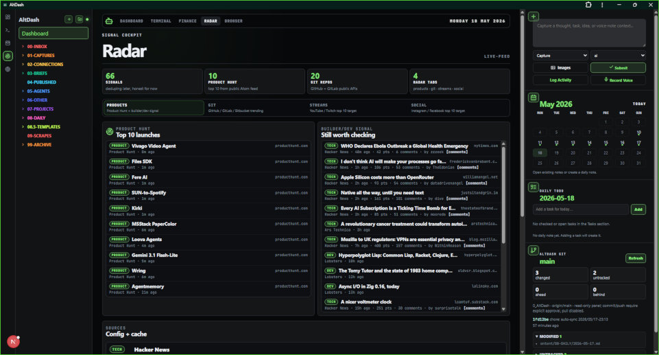
This also changes how I should design Radar. The dangerous question is “what feeds can I display?” because that question never ends. Product Hunt, GitHub, GitLab, YouTube, Twitch, Instagram, Facebook, blogs, RSS, self-hosted directories, AI releases, finance data, markets, whatever else I get distracted by next week.
You can drown in sources before you have built anything useful.
The better question is: “what can I do from this row?”
If the answer is nothing, the row probably isn't ready to be there. Or it needs a better action. Or maybe it belongs in a different tab. Or maybe I'm adding it because I like the idea of being the kind of person who would use it, which is classic bullshit and should be treated as such.
The AI side has to stay honest too. I don't want an agent turning every feed item into some fake insight because it has tokens to burn. That's how you end up with a vault full of plastic. Automatic capture is fine. Automatic connection suggestions are fine. Even automatic brief drafts might be fine once the shape is proven. But full writing needs approval because that's where the human judgement actually matters.
I need to be able to say “nah this is weak”, or “make it more about AltDash”, or “this is actually about the browser clipper, not dashboards”, or “delete this, it's boring”.
That's probably the boundary.
Let the machine help with friction. Don't let it replace taste.
So the rule for now is simple enough:
If I can't turn a dashboard item into a capture, project, or brief seed, I should be suspicious of why it's there.
Maybe that's too strict. Maybe some widgets are allowed to just be useful at a glance. Finance balances don't need to become a blog post every time I look at them. But even there, the action still matters. Categorise transaction. Mark subscription. Add goal. Check something off. The point isn't that every row becomes content. The point is that the dashboard should have teeth.
Glance can inspire the layout. Product Hunt and Awesome Self-Hosted can feed the signal. The browser clipper can catch whatever I find in the wild. But the product isn't the feeds.
The product is the loop that turns signal into work.
Otherwise I'm just building another place to look busy.
And I really, really do not need more practice at that.